3.16.2011

The week of Randomness

The last week has been a break in the mold of my life's normality. That's not to say it wasn't a good thing... it was actually fairly refreshing. I had to go back home to Grapevine (Texas) this weekend for essentially about 48 hours for my cousin's wedding... random. It started snowing Sunday night and continued all day Monday, and today I sat and ate outside at the tables downtown in the sunshine and nice weather... random. I saw a poster in my apartment complex notifying everyone of a lost kitten, the same lost kitten (coincidentally) that I found meowing at my doorstep last week. Random.

I could go on, but I'll stop there. And go on to...


Critique: 5 Final SJI Logos


Last week, we submitted all 20 of our logos and spread them out for the class to vote on. After everyone voted on their top 3 choices for each person's collection, Erica, Jan and Greg went through and chose the 5 we should work on and gave us advice on what we should change for our finalized works. Greg's biggest concern was that the logos didn't represent the idea of diversity well enough ( as the Sports Journalism Institute strives to bring both women and minorities in to the newsroom). It was really tough to try and portray the idea of diversity in such a small space and with so little elements. These were my revised 5 products -
I wasn't sure how to really tweak my logos, other than adding a little bit of color and trying to make the baseball stitches on the bottom left logo less literal. This Tuesday, however, Jan, Erica and Greg went around yet again and chose their two favorite (or in my case, three) out of our five.
      These are the three final logos I submitted. I added even more color after their comments yesterday, and tweaked the fonts and tracking a bit. I think this assignment was a really good exercise for me in order to get me thinking about design in a different way, the way of logos that is. I really liked getting to see what everyone else came up with while working with such limited material.


Response: Vox Magazine's Travel Issue

The. travel. issue. Well now, what can I say. At the beginning of the semester, when I saw four of our names under the travel feature, I just figured the feature would be long and we would all split it up. However, three other designers and myself quickly learned that this was not just a feature in an issue, but rather a whole special issue. 

So the last couple of weeks have been full of redesigning many of Vox's small design elements to match our theme of travel. We redesigned the byline style, the calendar, film fare, Ask Columbians (Bransonians), the sidebars, the heading at the top of each page, info boxes, chose new font families and color palettes, had two features to design, etc. 

My main focus was the Branson feature. Two of the writers and one of the photographers on Vox's staff traveled to Branson for a weekend and basically journaled their trip in both words and photos. Originally it was only slated to run in one spread, but the editors canceled one feature for print and moved it entirely online, so the Branson feature was allotted another spread. 

I think it was a really useful opportunity to see what goes into designing a whole magazine and recognizing all of the tiny elements you don't think about needing to be designed, especially with our Meredith prototypes in the works. It is a lot of dang work. I really cannot wait for the issue to come out tomorrow so I can see all of our work actually come to life in print! 

I will post photos of the issue, and the Branson feature, next week and critique it. :)

You Can't Miss... This!

The 500 Colored Pencils of Felissimo
      - So there are all types of "insert any word here" of the Month Club, where the club sends out samples of that product to the club members. Here, you can sign up to get sent 25 colored pencils each month for 20 months. They also send you a special case to hold all of the pencils, and each case they send you can link together, so at the end of the 20 months you can have a big display of all your colored pencils together. If you're impatient though, (like I would be) you can order all at once. Check out the different displays that've been made.


Also, check out this video. I thought this was pretty timely because of the iPad conference so recently. There is now a program for the iPad called LetterMPress that acts as an old letterpress, but electronically, so you can make letterpress art from the program. 

Here's the link to the video!


After while Crocodile,
        - Kaylee

3.09.2011

The Week of A LOT of Driving

Just like last week, this week has been crazy busy. I know this is pretty much every week, but the last two weeks have been exceptionally crazy. However, I really only made it crazier after driving 30 combined hours in the car between Thursday and Monday during a last-minute trip back to Texas. Safely back in Columbia with no rising insurance or broken truck pieces (only bags under my eyes), I have worked on a lot in a short amount of time... such aaassss...


Critique: SJI Logos


When Greg Bowers came to talk to us designers as a class a couple of weeks ago (was that all it was?! Time blurs together...) about the Sports of Journalism Institute, I was a bit anxious about having to design 20 logos for a society revolving around something in which I knew nothing about. However, when I got started, I was actually very surprised at how quickly the ideas started flowing. Not to say that cranking out a total of 20 was easy and that my creativity started running low around #15, but I found that after I would construct one, I would find think, hey I really like that typeface, but I want to use it with a different art element. So basically the trying to think of 20 completely different ideas was pretty tough, but knowing I had to get 20 done helped me to look at my previous ideas and how to tweak them and improve them.
  

It was surprising to see which ones my classmates voted for as the top five, as two of my favorites also seemed to be others' favorites, but the others that were voted on were not ones I particularly cared for. However, after hearing everyone else, that seemed to be the case with a lot of people. It's interesting how different people's points of view are, and how we think something we come up with is terrible when really it's the class favorite.

For next week, we are choosing only five to work on and recreate. I'm wondering if after that Greg, Jan, Erica and eventually SJI are just going to choose out of (18x5= 90 logos)?? That's a pretty large pool to just choose one. Perhaps we will eventually have to narrow it down to one. Either way, I think this assignment was refreshing because it's something very different than the Vox and Meredith prototype designing that we've been doing. I think that there are certain people who are better at designing logos than features, for example, because they are short and punchier, whereas others have more trouble because they have less space to get their idea across.


Response: iPad Conference


ipad event


Oh... the iPad. Why do I feel like the gadget has worn out its newness, and yet I feel like I never really heard many things (good or bad) about it until its been blowing up lately in the magazine world! I was talking to some younger Mizzou journalism students today who said that the requirements for the school of journalism here are changing so that now you will have to have a certain kind of MacBook, not just an Apple computer, and also some sort of touch gadget, whether it be an iPhone, iPad... etc. This is just so interesting to me, since I've only ever touched an iPad while playing in the Apple store. I just never thought there was anything so revolutionary about it... the fact that you touched the screen in order to use it instead of a mousepad didn't seem all that different.

But, I do agree that this tool makes complete sense for journalism. With print journalism, readers actually get print magazines that they can touch, carry around with them, flip from page to page, even make notes in the back or fill in quizzes with pens. When magazines started going online, there was none of this same feel anymore. Having the iPad almost seems like the middle ground, like the step between print and online, because you can touch it, carry it around, essentially "flip" from page to page.

At the iPad conference, Mike Haney was talking about how really it doesn't do a whole lot to ask readers what they want, because they don't know what they want. And they don't know what they want because they don't know what they can get. It is similar to when the first inventors of automobiles asked people what they wanted out of their transportation, and they said a faster horse. Well, yeah, because they didn't know that an automobile was an option or even what it was!

So, no I'm not sure whether all magazines are eventually going to be read on a device like the iPad instead of on paper, or if elementary school kids will stop learning how to physically handwrite anymore because they will all learn how to type instead, but either way the speakers at the conference made it clear that no one really knows. It is a general consensus of not knowing. Thus, everyone is just experimenting.

Mike Haney also said that if we were to take anything from his lecture, remember to always "try new things!"


You Can't Miss... This!


The Stockholm Public Library in Sweden. Now, architectural and interior design is a whole sect of design that I really admire and by which I am fascinated, but really don't know much about. Olivier Charles creates a virtual world for the interior design to this library. Look at the progression...
The last one is the finished product, actually located in the library in Sweden. I want to go here so badly. I'm pretty sure this would just kill Belle from Beauty and the Beast.

Also, something just fun, is some patchwork on the exterior of buildings with legos instead of concrete or brick. This is by Dornob Design Ideas. Really... what CAN'T you do with Legos??

Alright, well don't get too distracted rummaging through your old boxes trying to find your Legos... or googling "whole Lego houses" like I might have after seeing these...

Until next week - 

Ciao Brown Cow,
       - Kaylee


3.02.2011

The Week of Barely Managed Chaos

Wow. What a crazy and hectic last seven days. Involving things like housing lost kitties, internship interviews, last minute plans to drive back to Texas and of course, a lot of designing.

Critique: Lethal Injection Covers


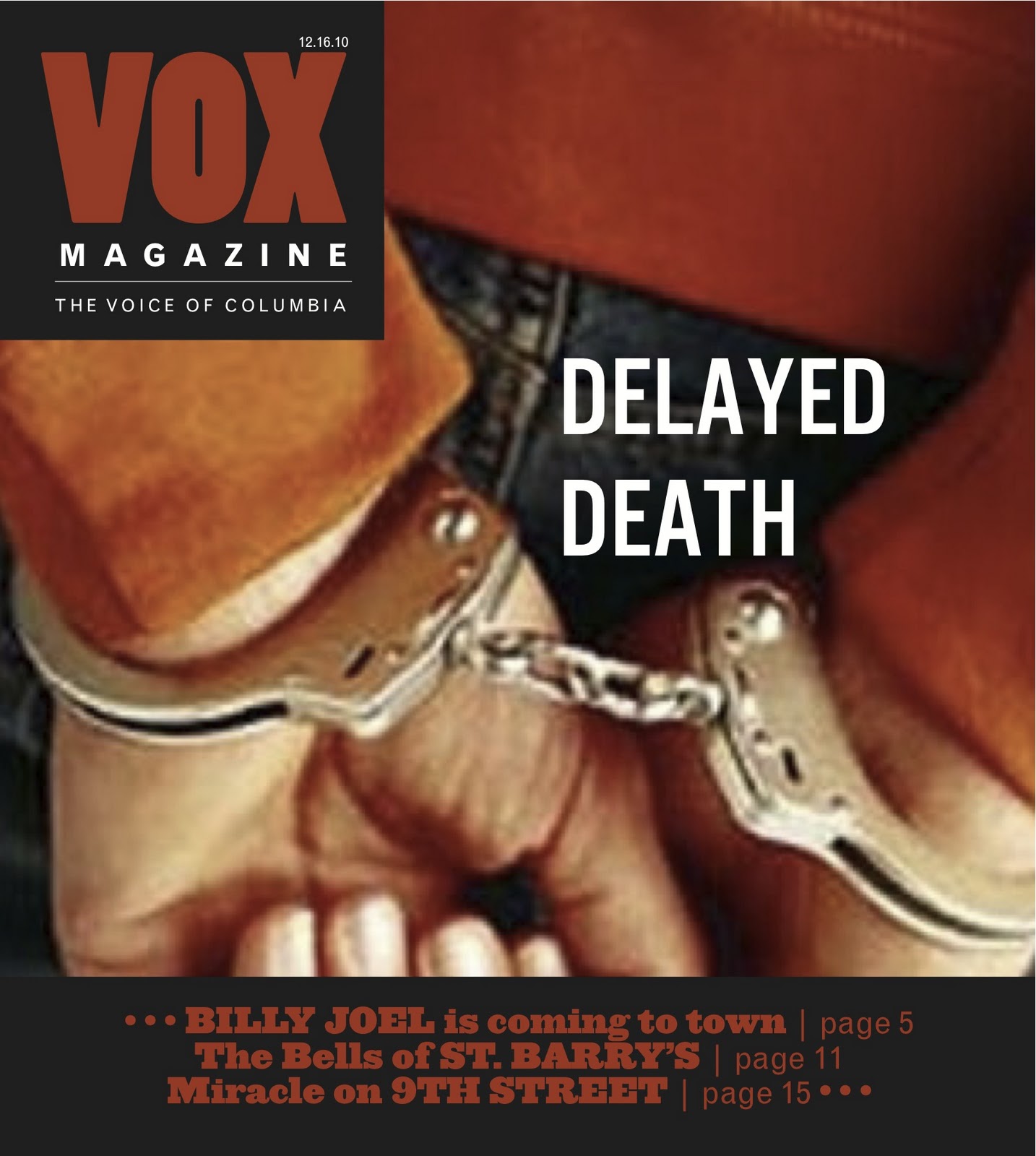
So this week was actually the first week I designed covers for Vox to compete within my cover group. We designed two different covers as a whole class the first two weeks of the semester, but since I am in the 5th and last cover group, it was a while before I did any more. The Vox feature in which we designed the covers around was lethal injection, but that was really about as much as we knew. When brainstorming ideas for my designs, my mind kept automatically picturing a giant needle. I mean it's pretty standard... someone says lethal injection, you think needle, right? However, I had qualms about that possibility... I felt like a giant needle could mean so many different things if a passerby glanced at it on the cover of a huge stack of Vox magazines in the magazine rack, and while that's part of the glory of a headline (to help explain), I felt that more context was needed. So, I decided to only actually feature a needle in a small detail, as replacing it as the "I" in the first cover design. I realize that this is simply an opinion of taste and context, and would totally understand Vox's decision in deciding to go with a needle photo.


So my thought process here was to quickly evoke the feeling of prison with the close-up of the bars, and feeling trapped. I wanted to keep it colorless and stick with the black and white to enhance this feeling. The feedback I received was to maybe have a shot of looking inside an empty-looking cell with the prisoner sitting in the middle, probably to add more of a personality and face to the issue. It would essentially be a placeholder photo, hoping that the photographer would take a photo similar when they shoot inside the prison tomorrow. 


This one was pretty much shot down. Though, I don't disagree whatsoever. My thought was that since the aesthetic drug is running out, and that's essentially the issue that Vox is angling the story toward, the pills spilling out of the bottle would be a good representation. However, the aesthetic isn't a pill. It's a liquid injected into you via IV. So, basically it didn't make any sense. Ex'ed out.


I think this was pretty much the most popular option. The idea of the hands behind the back handcuffed seemed to be overall liked, however I agreed with the notion that my font on this headline didn't really fit, and so for my final draft I took the typeface from the first jail bars cover and used it for this one as well. I also ended up changing the red color of Vox and the sell lines to a more orange color so it wouldn't look so "Hellfire redish."

Overall I think this cover was fairly difficult to design. The issue of lethal injection is a serious one, and thus it made it hard to balance serious enough, but not too gruesome or graphic. Either way, it wasn't a cheerful design.


Response: Historical Perspectives 


I presented a historical perspective on National Geographic, which back when I was set on photo and being a photojournalist, was one the magazines I admired the most. I am absolutely amazed with their photography all the time, which obviously a lot of others are too since it's one of the highest-regarded magazines for its photos. To be able to look at issues from over 50 years ago and still see great photos is pretty amazing. Design-wise, there are some noticeable differences that I talked about in my presentation, such as the lack of whitespace, straightforward use of text, photos rarely bleeding across the spread, and the more book/journal feel the design evokes.

After being presented with other publications from others though, I realize why Jan said National Geographic would be more difficult. Other publications, like Harper's Bazaar, Vogue, Esquire, etc. were really trying to break the mold of design and do things that were very different, and essentially "breaking the rules." This doesn't seem to really be National Geographic's style. As Jan said, they do spend a lot of time and energy on their designs, so it's not like design is something they're unconcerned with. They just work in it a way to showcase their amazing stories and photography.

I haven't ever spent a good chunk of time looking through old issues of magazines, so these presentations are generally showing me spreads and designs I've never seen before. And in fact, many of them are so different than what designs are currently, so it's very interesting. I'm actually really looking forward to see the rest of the presentations since about only half of the class presented.


You Can't Miss... This!


So #1) Bompas and Parr "Architectural Foodsmiths"
            So if you've ever wanted to design food installations, specializing in jello, these are the guys you should talk to. They work with architects to design these amazing jello molds that they then sell to companies like Disney, Kraft, and even museums.


#2) Atipo - A swiss graphic design legacy works with first of all putting different fonts into paint, and not only that, but then actually painting it onto faces. Check it out.


This is probably one of the coolest things I've ever seen. I want Helvetica Bold painted on my face.


Alright, that's it 'til next week.


Best wishes little fishes,
          - Kaylee

2.23.2011

It has been quite the week so far. Getting prepared for and giving our Meredith Corporation
presentations, which was Monday night for me, and then I've also been trying to crank out and finalize my application for a professional internship at Disney. Thus, I have been doing lots of designing, writing, finalizing of my online portfolio, dealing with sending official transcripts, etc. All of the REALLY fun stuff. But first up, the final Plaid Dad designs. 


Critique: Finalized Plaid Dad Designs  


      So although I kept my main vision and theme the same, there were many things I changed as well from my first draft of designs. If you compare the Plaid Dad designs from my last post to these, you can see that I first had an illustration on the cover of the toolbox on the workbench. My feature spread also changed a lot, partly because it was my least favorite of the three designs. The department spread is what I changed the least, but I did move the workbench there for the toolbox to sit on, and also moved my sidebar to the right page because of what we learned in Magazine Design about how people flip through the pages and will see it better. (Yay retaining knowledge from past classes!)

So were Erica's notes on my first designs and what I needed to change:

"-Pick a different cover image. Rarely do food magazine have an illustration on the cover. Show off the food. Full bleed. 
-There are too many numbers all over the department. Use a grid and organize it a little better. Pick a different font. Try not to use Vox fonts. 
-Feature seems the most dad-like. Not prissy or feminine, but masculine. 
-Work on non-narrative elements, we like that."

So, I definitely took the advice about the cover having a photo. I do agree that a photo makes it look more like a magazine. I also tried to make my feature spread easier to follow. I was satisfied with my changes and with my final designs, but I also liked the other Plaid Dads from my fellow group members. Overall, I think we all have some really great elements that we can merge together and make into a great design. I'm really excited to get the art director and designers figured out so that we can get goin'! Viva Plaid Dad! 


Response: The September Issue

I really can't believe I hadn't seen this movie before Tuesday. I believe it came out when I was in Spain and I kept meaning to see it once I got back to the states but never did. I loved it, and I'm usually not a huge fan of documentaries. But then again, considering the subject matter, I should have.

Because of the questions we received in class, I really paid attention to the role the creative director, Grace, filled. I think it's funny how most people assume that the manager, the president, the editor, all do the most work because their position ranks the top in hierarchy. However, I feel like in most all cases, it's usually the position right below the "head honcho" who really would need numerous bottles of de-stressing lotion. In this case, Grace definitely did most of the dirty work. She organized and agonized over photo shoots, projects, working with the designers, etc. while Anna, the editor-in-chief, spent most of her time saying yes or no and giving skeptical looks. This isn't to say that she doesn't have a hard job, I mean she definitely has to assume responsibility for the magazine, so anything that goes wrong falls on her, but the art director in this case had to be the reasonable one that deals directly with others.

I also think that the job of creative director encompasses way more responsibility than one would imagine. Previous to seeing the movie, I thought the creative director mostly worked with all decisions design. However, the position is way more the editor's right-hand. Anna, who doesn't seem like the type of editor who would go around offering praise frequently, raved about Grace for her greatness and brilliance. You go, Grace.


This photo comes from the feature Grace organized of female models recreating the look of the 1920s. I loved this feature, one because I love the look from the '20s, and two because it was nice to see photos taken in old looking restaurants, in front of mirrors, etc. instead of inside a studio. I loved that she purposely shot the photos softly as to represent the film from the time, instead of sharply. It was quite amazing that even though she's not the actual photographer, she still ultimately determines how the photos are going to look. I believe that should be a sign of a GOOD creative director.


You Can't Miss... This!

The illustration work of Gary Taxali. His work reminds me of old propaganda and war posters. I love this look. I love the bright colors but how they are used in a dull, kind of glazed over look. It's ironic how juvenile cartoons seem, but I can only aspire to ever be capable of this cartoonish kind of illustrating design. Apparently he goes around and has his own art shows, so he's a big name.


Alright well, time for Vox cover designing. I'm sure the end results will make their way here in the next week.


After while, crocodile -
      Kaylee

2.16.2011

The Week That Plaid Dad Really Begins

Firstly, highlight of the week that's non-design related (I know... there are other joys in life besides designing? Poppycock.)

  • I sat outside Starbucks in the sun today for two hours SANS jacket!! This weather automatically makes me happier, despite the heavy workload
Ok but anyway ->


Critique: First Draft of Plaid Dad Design


Previous to crafting my first Plaid Dad designs, I was frequent contact with the publishing group and went to a couple of their meetings where they brainstormed their ideas for features, departments, etc. I also talked to them a little bit about what they were envisioning design-wise, and then meshed it with the design I was envisioning in my head. All of this really helped me to get the true feel of the magazine and guide me in the direction they were looking to go. 

All in all, I'm pleased with my first draft of designs. There are definitely some things I plan on changing and improving on now that I have a little more time before the presentations, but there were very specific reasons I crafted my designing the way I did. My dad was/is a stay-at-home dad. He quit his job when I was around 7 years old because both of my parents were working up to that point and they decided one of them needed to stay home and get to know the kids that were spending too much time with their nanny. Thus, my dad raised me and my mom worked. This said, I am very passionate about this prototype because I feel that I know the target audience oh too well. 

The things I was concerned with while designing to really serve the target demographic the best:
  • Readable, bold and BIG type (my dad hates when he has to get out his reading glasses because he can't read things - makes him feel old)
  • Simple and clean - men tend not to notice the tiny design elements used just to be fancy
  • Not too many different colors - doesn't do much for them
  • Making cooking seem cool and manly 
  • Using relatable design aspects (toolbox, the diamond plate pattern)
Based on all of these things, I was happy with my designs... but am really interested to see what everyone thinks and says about them. The Ninja Noms feature was my least favorite spread because I had a lot of trouble figuring out how to fit everything without it getting too confusing for the eye. I will probably make the most changes on this spread.


Response: Mag +

I really love the concept of this program. I was actually really engaged during the over-skype presentation and intrigued by how simple the process seemed. Now, I'm sure that it's harder to learn that it looks, but I think that Mike Haney did a very good job at explaining it. I did get pretty confused when he started mentioning all of the vertical and horizontal layers, but if I were to learn how to do it, I think it'd be an interesting shift in designing for the iPad as opposed to print. I think some things would stay the same, but there would be other considerations you'd have to keep in mind for something going online. For instance, how you can place a photo or even play a video in the background and only scroll the top layer that contains the article. It's just a different kind of animal.

Seeing as how I am on the Plaid Dad team and they aim to publish an iPad product along with print, it would be really useful to know how to design on this program. However, being able to do this kind of design seems like you'd really have to be more knowledgeable about the graphic design side of design. 

To be honest, I really do hope we get this program, but if we did I'm concerned I wouldn't be able to learn how to use it in time to create designs for the Meredith Project. Or at least, I wouldn't have time to get really good at it. 

All in all though, the program seems inventive and really quite useful if it works as it was presented.


You Can't Miss... This!

Autumn Whitehorst's Illustration Art.

While compulsively stumbling like I do with just the "design" box checked as a preference, I found "The Art Department," a company that works with consultants, artists, illustrators, etc. If you go on to browse through each of their departments, you can look at each individual and their portfolios. There are a lot of amazing and talented individuals presented, but one in particular that I was really drawn to was Autumn Whitehorst. Some of his illustrations: 


I think these are just gorgeous illustrations and use beautiful colors and textures. I'm really curious as to how Whitehorst made these and wish there was some way I could ask him. Would you make something like this from a real photograph? Would you use illustrator or photoshop? Or both? Or something completely different? Hmm...


Also...

I absolutely LOVE designspongeonline.com. There are so many amazing craft projects that I would love to try, and ya know perhaps I will this time. I've learned you've just got to make free time for yourself... you can't really wait for it or else you'll be rotting... or looking for the Tuck Everlasting well of life. But I've found a project I want to venture into...


A chandelier made out of PLASTIC STRAWS. Yeah. Go look at this website.


Alright well that's it for now.

Keep it real spotted seal,
      Kaylee


2.09.2011

Getting Back into the Swing of Things...

Oh, what a great week for there NOT to be a blizzard. Congratulations to all of us for surviving!

Up firsttttttttt...

Critique: My First-Ever Typography Creation


Alright, because I didn't design anything for Vox between last Wednesday and today (don't worry, it's all going to catch up with me later this week), I wish to critique my first attempt at a fancy typography creation. I've seen things like this many times, for instance the examples I previously posted and talked about, but I always assumed I'd never be able to actually make something like this. However, while working on my online portfolio over the snow days and past weekend, I realized that I had everything but a nice image on my "Home" page. I decided I wanted to make a logo-type of creation featuring my name to put there. Thus, I shopped for typography logos online for a while that had video tutorials accompanying them, and ended up choosing this one -


The video tutorial was about an hour long, but it took me pretty much all day (including TV/snack breaks of course) to finish. I decided I really didn't like the heads of the screws on this image, and also wasn't a fan of the floral patterned background. As you can see, I also decided to do some different things with coloring and the blue floral pattern. While my end product does resemble the one online, I feel like I also made it much more "my style" and to my liking.

I am wondering what y'all think about it and need your help critiquing it! I am very happy with it overall and learned SO much as far as Photoshop goes, and even a little bit more about Illustrator. Perhaps my biggest qualm is the way the "y" came out... I thought I was being clever in the way of my artistic license by flipping it horizontally, but unfortunately it's hard to see after being beveled and but over the blue background. But then again, I think it just adds to the aesthetic appeal.


Response: Historical References in Modern Design


William Owen's piece from Modern Magazine Design was enjoyable, and of course as a visual person I mostly appreciated the photos and examples of the evolution of design throughout history. In its earliest days, magazine design strongly resembled that of newspapers. In fact, it was quite tough to distinguish the two (design-wise). They both consisted of a lot of text flowing in wide-set columns with few photos.

For instance, the top spread on this page is overwhelming with text. Granted, most of this trend happened before the burst of graphic design. However, certain publications today really reflect this historical style of very text-heavy pages. 

This spread is taken from a recent issue of The New York Times Magazine. This magazine does a lot of text-heavy design in various issues, but the four columns being lined up that far down the page also seems to resemble an older style.

Here, we have a cover of Fortune from the 1930s that features one main photo that doesn't take up the whole page, and also doesn't have any sell-lines. The look is very clean, whereas many modern magazines clutter their covers with sell-lines. But here is a good modern comparison to this style - 
While this 2005 issue of SanDiego Home/Garden  has slightly more text, it doesn't feature any sell-lines and also features a photo in the center of the cover that does not bleed across the whole page.

My last example - 
This page comes from a 1957 issue of Vogue. The close-up photo of the lady's hand with her one large ring and one fingernail that's sporting a different color than the others is something unique for a photo from that period. Interestingly enough, 

this page in the 2004 issue of Needle presents an uncanny resemblance, especially with the large jewelry and the hands all being on buttons of some sort. The evolution of graphic design throughout the 20th century seems to feature every decade breaking the previous decade's mold. 


You can't Miss... This! 


A history of Google logos! Not only is this endlessly entertaining and fun, but also really interesting to see what Google's designers have come up with, especially because most are designed for holidays/special days of the year which, of course occur every year. There are so many things about this that make me curious... Questions arise such as:
  1. How do you get the job of being a designer for Google?
  2. What else do these designers do?
  3. The Google logo design seems like such a small and trivial part of the website, but the branding is so important... so how does Google choose some of its more random special days to feature and design a whole logo for?
And ya know, so on and so on. I thought this would be a good week to post something like this since we have our big logo competition coming up. :)

ALSO - 

Not to sound vain by putting this under the "You Can't Miss" category, but alas a something a little more personal: a website of my own. Well, technically, not my own. Mine through Weebly... a web host for online portfolios. Unfortunately, and boy do I mean unfortunately, it's beginning to look a lot like... real life. Job searches, resumés, portfolios, all things scary and unknown. 

I have always been a bit obsessed with Disney. Not just their movies, but also their magical, magical home in Orlando. Being as though I am unsure what I want to do for the rest of my life right now, I feel as though an internship is a good transition into the real world. Technically it's a full-time job that pays, but is also non-committal and hopefully will ween me onto something more long-term. Thus, I am applying for an Internal Communications Internship at Disney World for the Fall, but definitely keeping in mind it's a long shot. But, they already have positions posted on their website and I need to apply... mmm soon. 

SO, I spent most of my trapped-snowglobe week working on my online portfolio. The only things I have to finalize is my photography section. I have a few more photos to add, but other than that it's pretty conclusive. And here again, I am going to ask for y'alls help with opinions and critiques. Anything you like/dislike about it, or think I should change about it before I begin sending it out with future job/internship applications would be greatly appreciated!

Thanks y'all!

Peace Out, River Trout -
      Kaylee

2.02.2011

The Week of the Snowpocalypse

To say the least, the last seven days have been interesting. Especially for a true Texan who has only ever experienced this amount of snow while in a ski suit, perched on top of a mountain about to schuss to the bottom. However, before I was snowed into my apartment and clearly forced to live in my pj's for the past three days, I stayed up for the better part of Thursday night in order to finish my Spring Preview cover, splash page and feature spread.


Critique: Spring Preview Designs


          I thought long and hard about how to approach the Spring Preview designs. I had a rough time with brainstorming ideas because I felt like the assignment was so open-ended. We had total freedom with the designs since the issue isn't over one specific article, but rather a season-long agenda. I knew everyone's designs would come out all looking so different, which I was excited about. Eventually, I decided to go with literal springs, but try to make them look more fun, and turn them into more Spring-looking colors. I also wanted to have words featuring events and things happening that looked like they were literally being sprung in motion. Thus, this is the cover I ended up with. I think I definitely deviated from my usual style, and tried to embrace more white space than normal. Unfortunately, I later discovered that I wasn't the only one with the literal spring idea. So much for originality. 


        As for my feature and splash page, I was really unsure how to design around sections instead of a story. It was quite the challenge since I'd never seen Vox's style for this type of feature. I thought that putting them in columns would be the easiest way for the reader to figure out the sections and be able to set them apart. After looking at others' blogs and seeing the way they did these features, I realize that mine could've been just as easy-to-read while being a lot prettier. But hey, improving and learning from others is what this is all about, right? Live and learn.


Response: First Class Critique 

      Last Thursday in lab, we critiqued each others' first design assignments as a class. It honestly fascinates me to see everyone elses' designs because often, there are things that people have done that I never would have thought of. I wonder how we can all have the same exact assignment, and come up with such different results. Granted, last week we were all working with the same story and photos, and so many of our covers were similar. Of course, it makes why the winners were chosen, as they were the only ones that probably stuck out in using different photos as everyone else. But even with the feature spreads, no one had the exact same design. I think just being able to see everyone's work is the most helpful and insightful part of lab critiques. Hearing what others have to say about your work helps, but I feel that most of the time people are too nice and don't want to say everything they really think. Thus, the usual response goes something like: "Well I really like how you put your title on that colored bar. I also like your typography. Maybe I wouldn't have chosen this color because it distracts from the photo, but overall you did a really good job!" It's humorous how we feel we have to quickly say how much we like it (even if we really don't) after we say anything that can be remotely considered constructive criticism. That's how it's going to be in the real world, right? Rainbows, flowers, and overly nice and careful criticism from your colleagues. Yes. Right. Glad we are prepared. 

You Can't Miss... This - 


      This video was featured on the blog I'm following for the semester, Ilovetypography.com It is a fancy and impressive video of typography-transforming designs. Check it out.


    Also, I found this through Stumbling my way through amusing design sites, and had never thought about it: the design difference from country to country. It makes loads of sense though. Different parts of the world have different cultures - food, clothing, cars, slang words, spare-time preferences, etc. all depends on location. So why wouldn't design? There are many websites that discuss books that are released internationally, but have different jackets that are published depending on where the book is being released. For example: 


   One cover is the U.S. design, and one is the U.K.'s. Can you guess which is which?

   The following article explores the different design techniques and explains how, essentially, when designing a book cover you are trying to get across the message of the book, but people in different regions read and interpret fiction in different ways.


Here's a paragraph from the article:

There are colder business reasons for creating jackets that differ by territory, says Julian Humphries, head cover designer at Fourth Estate: "Different sales channels have different sensibilities." It can be hard to pinpoint what exactly these sensibilities are – "It's a cultural thing," he says, "as taste-driven as different countries eating different things for breakfast" – but broadly speaking, literary fiction is an easier sell in mainland Europe than in the UK or the US, so publishers there can be less overt in their attempts to grab the attention of customers. "In Europe you often see book covers with simple images and plain type, and that sells books for them," says Burton, whose colourful design for A Fraction of the Whole by Steve Toltz stands in stark contrast to the black-and-white German edition. "The UK book market is more competitive, all the covers in shops shouting: 'Buy me!' We have to put on a bit of extra spin."   

Who knew, right?  Oh, and the above covers were the U.S. design, and then the U.K. design, respectively.

Alright, time for some more hot chocolate! I know y'all are all probably way more sleet/snow/ice-experienced than this Texan, but still be careful. 

Until next week,
     - Kaylee