5.04.2011

The Week of Iowa

In two days, we wake up at a time of morning that I've only ever seen because of staying up that late, and join the chirping birds in the dark abyss outside to climb on a bus and travel to Des Moines, Iowa.  I've never been to Des Moines, or Iowa for that matter, so I hope our experience leaves a positive impression on me. The publishers and designers have been working extremely, and I mean late hours, weight loss, permanent dark circles under the eyes kind of hard, on our respective magazines to present them all to Meredith Corp. at the end of the semester. Well, this is it. You'd think that after working on something for a whole semester, you'd be prepared to talk about it for days on end, however our 40-minute presentation ahead is pretty daunting. I'm really excited to show them what we've put so much energy into though, and I'm even excited to explain it and delve into why we love the concept... let's be honest, I'll probably bring up my dad. I'll probably bring up that he raised me and inspired my interest in Plaid Dad. I'll probably leave out the Elvis suit.


Critique: Mini Portfolio


So I wanted a cover that looked professional, but also reflected my personality. I found a tutorial online on how to make an Illustrator typography-type element that looked similar to this, so I followed it and then went back and changed things and tweaked it to make my own, and also changed the colors. Below is my cover, and then an example of a spread. I have the label on the left, along with a tab of the section. I really like the way it turned out, though I have things I need to tweak after seeing a proof. It is a lot of white, but I think keeping the white space helps it look more professional. The emphasis needs to be on the work itself, not the design of the portfolio necessarily.


I can't wait to see the final product!

Response: iDad

Our Plaid Dad app's called iDad, which theoretically would contain content from both the print version, and offer new content, and also feature a store where readers could buy some of the zany gadgets and other things that iDad's content displays. We did not make fully execute all of our ideas, but we did execute a home page, which has buttons that lead you to section pages, and then from the section pages you can go to the stories/pages that fall under that particular category. In the real iDad app, we would feature a lot of hands-on, service type of features where dads could tote around their iPad in the kitchen to look up recipes, watch videos on how exactly to whisk that egg in the best way possible, or concoct the perfect caffeinated craving.

Home Page
'Drink Me' Section

 BYOB page from the 'Drink Me' section
 'Rescue Me' section
 iDad's Recipe Dictionary that falls under the 'Rescue Me' section
 'Fun with Food' section
 Destination Dining page (scrolled down) from the 'Fun with Food' section
 'Conquer the Kitchen' section
 Renovation Station page that falls under the 'Conquer the Kitchen' section

It's really exciting to see our app function on an actual iPad. Granted, it's a very basic rendering, I'm still so thankful that I learned how to do this and can't wait to show the Meredith editors.


You Can't Miss... This!

Japan's Alice in Wonderland restaurant


I've decided that if my print and graphic design skills don't get me anywhere, I'm going into interior restaurant design. How cool would it be to be able to design something like this when you've got a huge budget that allows for it? At least, I'm assuming a huge budget...
Gotta go, Buffalo,

     - Kaylee

4.27.2011

The Week of Frantic Finishings

So, once again, things have been crazy. I cannot believe how quickly the semester is winding down, and how little time we have left until graduation. Sixteen days and counting... it is incredibly scary. I know, I know... it's exciting too... maybe?

Anyway, there has been a lot accomplished in the last couple of weeks, and will be even more in the next two. Just buckling down in order to make it to graduation... hopefully there'll be a little fun sprinkled in there somewhere as well.


Critique: The New Pornographers Cover


For this cover, Vox wanted to feature the band, The New Pornographers on the cover and had already found the specific publicity photo they wanted to use. For our cover group's competition, they wanted us all to use this same photo, just trying to use it in different ways. This was my final cover, and I decided to cut out all of the members of the band and then insert an artsy illustration of rain behind them. Obviously I chose rain because of their umbrellas, but I wanted a background to parallel the fairly serious tone of their not smiling. I also used a font that looked almost identical to the one that they use on their website, because I think it's important to convey their tone as they see it.


Response: The END of Plaid Dad (print edition)

I cannot express in words the weight that has been lifted off of my shoulders now that the print version of Plaid Dad is at least done. The hardest part is behind us. We are still working on our website and our iPad app, but since we have all of our design structure down and finalized from print, it hasn't been too difficult to transfer our tone, color palette, templates, etc. into technological prototypes. We are off to Iowa to present to Meredith next Friday. Although I am nervous, I couldn't be more proud of all the hard work each member of the team put into it. I know our countless hours spent on tweaking everything about the design will show through, and even if not everything about Plaid Dad is loved by everyone we present it to, I know we will have so much invested in it that we will be able to strongly defend ourselves, and I'm sure they will see how much passion we have for how it turned out. Here are some samples of some of the final pages (note: keep in mind that some of them are much lighter in the jpeg format)


 I'll keep ya updated on our website and iPad progress!


You Can't Miss... This!

34 Cleverly Designed Inventions

I mean, they might be created using a different kind of design, but it's still design, right?


That's all for now, brown cow!

   - Kaylee

4.13.2011

The Week of No Sleep

Now, I know I'm not one for anything that can be considered close to a normal sleeping schedule, but the past few days have been exceptionally strenuous. Even my body is starting to rebel a bit. However, the upside is that I have been filling all of my awake-hours with productivity. Usually, I take one too many email breaks... or coffee breaks... or catching-up-on-the-lastest-Grey's-Anatomy breaks... but alas, not now.

We are down to the wire on our magazine prototypes, which after swimming through and pushing aside the stress, is really exciting. Every member of Plaid Dad has worked so hard and put innumerable hours into this project, so I know it is going to be a sublime reward for all of us when we are finally done. We have our second critique tomorrow morning, and take our first trip to the printer to receive our first proofs, hopefully by Friday. I know there will be a great number of changes we'll need to make within the next week, but next Thursday is the day.

I cannot believe how fast this semester has flown by... all of our classes are reaching their last pinnacles and then graduation and then and then... Is this real life?


Critique: 30 Under 30 Package


I must say... this was not my favorite Vox assignment. Now, admittedly, my disposition can probably be largely attributed to the fact that I was focusing much more of my attention on prototype matters, but even so I just had such a tough time figuring out how I was going to organize everything. I've realized with both 30 Under 30 and the Spring Preview issue that I struggle with organizing a large number of text that is chunked into blurbs. I think I always start off over-analyzing my plan of action because I know there is probably a really creative way of doing it and making it look really nice and service-journalismy, but I get all flustered from the beginning over the daunting task.


Now a couple of things on here obviously weren't exported correctly... oops. The arrow pointing down to the "30" on the "N" is supposed to flow from the letter and not be awkwardly large, and Adam on the second spread is quite blurry. But overall, you get the picture. I decided to try some typography fun by typing all 30 names in the shape of a "3" and a "0" to make the thirty. I wasn't sure how well I liked it after I finished it, but I had spent so long on it that I stuck with it... perhaps not the best thing to do, but at least it shows I can play with typography some I suppose. In contrast, I did something completely different for the cover. 


So when I thought about 30 pretty cool people that you don't know and that Vox is introducing you to, I thought about... so exactly who are they and why are they that way? So then I thought of the game, Guess Who. I thought it would be really visually appropriate to cut out each of their faces, turn them into cartoons and place them on the cards of the game, since we are trying to get to know them. I really liked my idea, but I know I could've executed it much better with more time. I also only wanted to do the front row of cars just to illustrate my idea and show that it could be done with all 30 people if it was chosen. I also really want to play this game again now... it's been a long time!


Response: Mini Design Portfolios

Surprisingly, I really enjoyed starting to talk about our mini portfolios. I thought I would feel really stressed out about doing this since it's a pretty big deal, but I love projects and crafts. I love scrap booking and putting together pictures, etc., so I am really excited to have something like this of my own. We looked through a plethora of portfolios from previous designers, as Jan had boxes and boxes of them from years ago and was becoming fairly nostalgic and very protective of her memories. 

We were shown a lot of different examples... some more on the hand-made side, scrap book side, artsy putting the mini-book into a little pocket or envelope, etc. However, I think for multiple reasons I'm going to go with the more professional look. For one, I think they hold up better for a longer amount of time, two - they are much more professional and appropriate to send out to potential employers, and three - they look cleaner and more organized to me. 

I think I'm going to go with the 7 1/2 x 8 size because I think it's a happy medium between the large magazine size and the smaller ones where I have to squint to see the designs within the pages. I think I am going to include design and photography, since I have kept up with my photography and I do want to market my photography skills as well as my design... not as largely but I definitely want to include it in my skill set. 

It's so funny how from the beginning of the semester until fairly recently, I have huffed and puffed about how much work Advanced Design is and how many different things we have to keep up with and concentrate on, and now I am really starting to appreciate it. I think I have progressed so much this semester and have probably quadrupled my amount of clips. 

Oh and side note: I think the book espresso machine ( which is an option for printing our portfolios) is SO cool. I remember hearing about this when I worked at The Missourian and we were coming up with stories to report on this "newfangled coming technology." And now it exists. And it's pretty cool - Here's a a link to a video if you're a nerd like myself and like to watch how it spits out books.


You Can't Miss... This!

Pinhole photography. 

So we know that I am obviously very intrigued by photography. Pinhole photography is something that has always been completely fascinating to me. Essentially, a pinhole camera can be anything that's hollow inside and lightproof, like a metal can, an oatmeal box, a shoebox, a car or a room even. You just have to make sure no light is going to pass through, and then you have a whole on one end, and film or photo paper on the other side, and when the light passes through it reflects the image onto the film. It is pretty amazing. Anyway, I remember we experimented with old pinhole cameras in my into photojournalism class in high school, but they're pretty finicky and I don't think I was very successful at that point. 

Pinhole photography also has a lot to do with design actually... You can really design your camera based on what kind of photos you're going to be designing. Framing a photo shoot with a pinhole camera would require a lot of design-thought.

A project that I REALLY want to pursue as soon as I find some time is to make my own pinhole camera and then do some of my own photography with it. Photos from pinhole cameras usually come out softer and not as sharp as cameras with actual lenses on them because the exposures have to be longer, anywhere from a few seconds to MONTHS. I think cameras are just fascinating contraptions in general... but anyway I will stop my raving and show some examples of pinhole photography. 


Another time, porcupine - 
     Kaylee


4.06.2011

The Week of Back to Reality

Unfortunately, spring break is over. Aure voi breath of fresh air, it was nice seeing you again. Now it's back to the daily grind. Six more weeks 'til I'm a scholarly and useful member of society... scary. But that's for later, 'cuz for now...


Critique: Vox Department Page


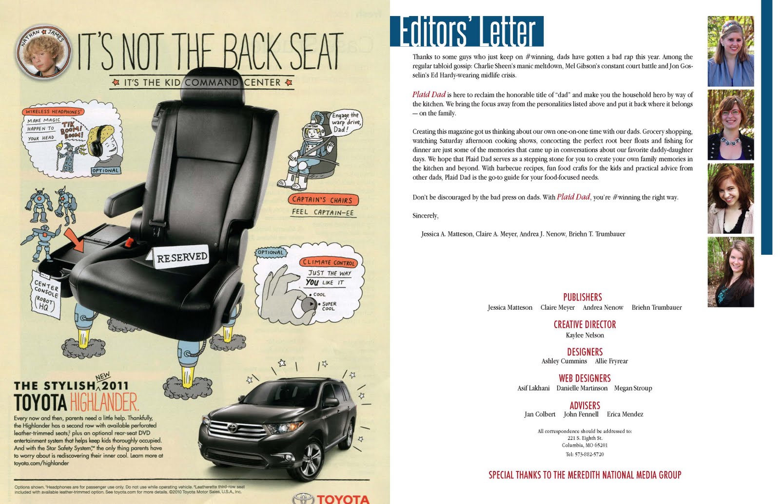
Oddly enough, this far into the semester I have only designed two music department pages. However, I have a couple more coming up soon and close together. I haven't talked very much about department designing for Vox here yet, so I thought I could assess an example.

It's surprising how tough it is to design just one page in which you already have the text, photos, and general template for. Perhaps though, the more specifics you have to work with, the more limited you are. For this particular department page, I had to make the playlist. The only tricky part was finding a photo with enough open room on the left side to put the text. Crafting department pages always takes me longer than I think it will in the beginning, but I think designing these pages is an exercise that deviates from our designer-norm. 

Usually as designers we are told to go big and get crazy with first drafts because it is always easier to be scaled back than to be told to get bolder, however designing these department pages with such specific directions is a much more detailed and meticulous process. I think this is a useful practice just in order for us to start looking at the details and how to design around the content, instead of assuming that the content will follow our desired design scheme.

I don't think that I will have time to get particularly well-versed in doing department pages quickly in this semester. I feel like I would need to do it much more often to get faster at designing these. However, I think that this probably applies to many things in life and to many people as well.


Response: Spring Break Photo Projects

This sort of project was right up my alley. I love photography, of course since I did it all through high school and started out as a photojournalism major, so I am already used to carrying a camera around with me wherever I go and the odd looks as I pull out my mega-camera with huge lens attached. I am known as the photographer in my group of friends and family. Everyone knows that I will be taking photos wherever I go so they don't worry too much about remembering their own. 

Even though I switched my sequence to magazine design in the J School instead of photojournalism, I still absolutely love photography as a hobby or passion and can't stand the idea of ever buying a framed photo as art decor that was taken by anyone else. That isn't supposed to sound conceded, but rather that I just strive to always make my photos good enough that I would like to see them hung on the wall above my bed.

So we were asked to keep a photo journal of the week of spring break and take one photo of each day that was inspirational and that would stand as a nice reminder of the week. Though I only went home, (to Grapevine, Tx.) I had a fantastic and relaxing time with my family, as always. I absolutely love Texas and fully plan on returning in the near future, and find many things around my home intriguing and inspiring. (Not to mention, the temperature and appearance of the sun doesn't hurt either.) My week was follows:

Day 1: Saturday
 A gigantic metal structure of a lone star complete with cowboy hats covering the whole thing, which was hanging in the hotel next to where my sister's dance competition was located in Ft. Worth. I want a slightly smaller version of this in my future home.

Day 2: Sunday
My dear sister poses in front of the plethora of trophies that her dance team won at her very last competition before she graduates high school.

Day 3: Monday
My dad and I finally joined the rest of the world in owning smart phones, about 2 years too late, but were nonetheless pumped about it. We spent a while taking pictures of each other and playing with our new gadgets for most of the day.
Day 4: Tuesday
Meet Tux. He is a sassy old man of a cat, but he is my favorite. Am I not supposed to pick favorites out of my pets at home? Oops...

Day 5: Wednesday
My boyfriend takes the week off of school a bit early to come visit me, and these are his boots in contrast with my living room rug. I must get myself a new pair of cowboy boots soon.

Day 6: Thursday
My neighbor, Andy, was such a great sport and posed with his daughter for a photo shoot for the cover of Plaid Dad. This isn't the photo we will use for the cover because we want a candid shot, but here is a cute one of the both of them smiling.

Day 7: Friday
I walked around Main St. in my city with a few friends for fun (and to look for material for my typography project) on this very nice and sunny day, and the feed store was selling baby chicks and duck since it's so close to Easter. I have really wanted a pet duck for a while now, and it was extremely difficult for me to pass up taking home this little guy. (P.S. - Duck diapers exist... google it)

Day 8: Saturday
My sister got asked to prom by her future-date hanging this huge sign in front of our house. We had to get her to go out to dinner with us so that he could be there standing underneath it when we pulled up back at home.

 
Day 8: Saturday (Cont.)
My sister and her date before her dance team's banquet. She gets her good looks from me, of course.

Day 9: Very Very Early Monday Morning
I drove back from Grapevine to Columbia, and the clouds were so ominous and cool looking that I risked my life by taking a few photos while driving. As you can see there were just so many cars on the road I could've potentially run into...


And here is the product of my typography project. I walked around to try and find letters in everyday things. It was really invigorating actually how it made you look at buildings and the ground and seemingly ordinary things in a different way. I spelled out La Vita E Bella, which means Life is Beautiful in Italian. I plan on printing out these letters individually and then leaving matte in between each in one big frame. I've been wanting to do one of these for a long time, as I was actually given one as a gift that spells out 'Texas'. Now I have one of my own!


You Can't Miss... This!

Weird and funky furniture designs? Yes, please! I mean who hasn't been bored out of their minds while accompanying your parents furniture shopping before... or at least ya know before we started growing up to be as old as we are now (eek!) we used to be bored by those kinds of things. Check out these fresh ideas by Straight Line Designs-->


Until next week (if I make it to that point... whew what a week),

See you soon big baboon, 
      - Kaylee