We are down to the wire on our magazine prototypes, which after swimming through and pushing aside the stress, is really exciting. Every member of Plaid Dad has worked so hard and put innumerable hours into this project, so I know it is going to be a sublime reward for all of us when we are finally done. We have our second critique tomorrow morning, and take our first trip to the printer to receive our first proofs, hopefully by Friday. I know there will be a great number of changes we'll need to make within the next week, but next Thursday is the day.
I cannot believe how fast this semester has flown by... all of our classes are reaching their last pinnacles and then graduation and then and then... Is this real life?
Critique: 30 Under 30 Package
I must say... this was not my favorite Vox assignment. Now, admittedly, my disposition can probably be largely attributed to the fact that I was focusing much more of my attention on prototype matters, but even so I just had such a tough time figuring out how I was going to organize everything. I've realized with both 30 Under 30 and the Spring Preview issue that I struggle with organizing a large number of text that is chunked into blurbs. I think I always start off over-analyzing my plan of action because I know there is probably a really creative way of doing it and making it look really nice and service-journalismy, but I get all flustered from the beginning over the daunting task.


Now a couple of things on here obviously weren't exported correctly... oops. The arrow pointing down to the "30" on the "N" is supposed to flow from the letter and not be awkwardly large, and Adam on the second spread is quite blurry. But overall, you get the picture. I decided to try some typography fun by typing all 30 names in the shape of a "3" and a "0" to make the thirty. I wasn't sure how well I liked it after I finished it, but I had spent so long on it that I stuck with it... perhaps not the best thing to do, but at least it shows I can play with typography some I suppose. In contrast, I did something completely different for the cover.

So when I thought about 30 pretty cool people that you don't know and that Vox is introducing you to, I thought about... so exactly who are they and why are they that way? So then I thought of the game, Guess Who. I thought it would be really visually appropriate to cut out each of their faces, turn them into cartoons and place them on the cards of the game, since we are trying to get to know them. I really liked my idea, but I know I could've executed it much better with more time. I also only wanted to do the front row of cars just to illustrate my idea and show that it could be done with all 30 people if it was chosen. I also really want to play this game again now... it's been a long time!
Response: Mini Design Portfolios
Surprisingly, I really enjoyed starting to talk about our mini portfolios. I thought I would feel really stressed out about doing this since it's a pretty big deal, but I love projects and crafts. I love scrap booking and putting together pictures, etc., so I am really excited to have something like this of my own. We looked through a plethora of portfolios from previous designers, as Jan had boxes and boxes of them from years ago and was becoming fairly nostalgic and very protective of her memories.
We were shown a lot of different examples... some more on the hand-made side, scrap book side, artsy putting the mini-book into a little pocket or envelope, etc. However, I think for multiple reasons I'm going to go with the more professional look. For one, I think they hold up better for a longer amount of time, two - they are much more professional and appropriate to send out to potential employers, and three - they look cleaner and more organized to me.
I think I'm going to go with the 7 1/2 x 8 size because I think it's a happy medium between the large magazine size and the smaller ones where I have to squint to see the designs within the pages. I think I am going to include design and photography, since I have kept up with my photography and I do want to market my photography skills as well as my design... not as largely but I definitely want to include it in my skill set.
It's so funny how from the beginning of the semester until fairly recently, I have huffed and puffed about how much work Advanced Design is and how many different things we have to keep up with and concentrate on, and now I am really starting to appreciate it. I think I have progressed so much this semester and have probably quadrupled my amount of clips.
Oh and side note: I think the book espresso machine ( which is an option for printing our portfolios) is SO cool. I remember hearing about this when I worked at The Missourian and we were coming up with stories to report on this "newfangled coming technology." And now it exists. And it's pretty cool - Here's a a link to a video if you're a nerd like myself and like to watch how it spits out books.
You Can't Miss... This!
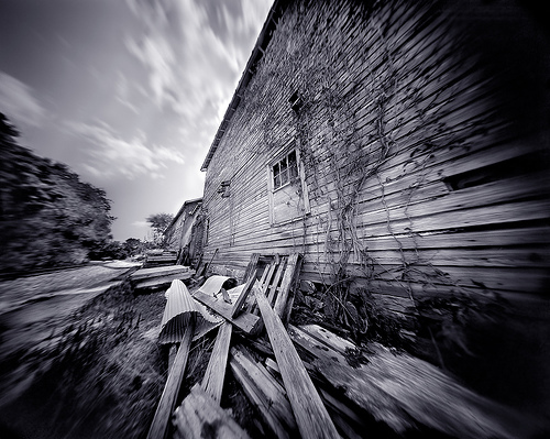
Pinhole photography.
So we know that I am obviously very intrigued by photography. Pinhole photography is something that has always been completely fascinating to me. Essentially, a pinhole camera can be anything that's hollow inside and lightproof, like a metal can, an oatmeal box, a shoebox, a car or a room even. You just have to make sure no light is going to pass through, and then you have a whole on one end, and film or photo paper on the other side, and when the light passes through it reflects the image onto the film. It is pretty amazing. Anyway, I remember we experimented with old pinhole cameras in my into photojournalism class in high school, but they're pretty finicky and I don't think I was very successful at that point.
Pinhole photography also has a lot to do with design actually... You can really design your camera based on what kind of photos you're going to be designing. Framing a photo shoot with a pinhole camera would require a lot of design-thought.
A project that I REALLY want to pursue as soon as I find some time is to make my own pinhole camera and then do some of my own photography with it. Photos from pinhole cameras usually come out softer and not as sharp as cameras with actual lenses on them because the exposures have to be longer, anywhere from a few seconds to MONTHS. I think cameras are just fascinating contraptions in general... but anyway I will stop my raving and show some examples of pinhole photography.


Another time, porcupine -
Kaylee
Kaylee, I love your Guess Who concept! I use to play that game all of the time. I need to put it to good use the next time I go home, ha. I think the cover looks great though. Very creative. I need to start doing a better job of thinking outside of the box. I like your typography "30" on the opening page. It turned out really good.
ReplyDeleteI really like the Guess Who illustration. I think it is a fun way to look at this story. I almost miss that in your inside spreads. I think that could have been a fun concept to carry through your design. But I do like the arrows that you used, so I am torn. All in all, well done.
ReplyDeleteI really like the idea of doing pinhole photography. It would give you a whole other realm of inspiration for design.
ReplyDelete