Anyway, there has been a lot accomplished in the last couple of weeks, and will be even more in the next two. Just buckling down in order to make it to graduation... hopefully there'll be a little fun sprinkled in there somewhere as well.
Critique: The New Pornographers Cover

For this cover, Vox wanted to feature the band, The New Pornographers on the cover and had already found the specific publicity photo they wanted to use. For our cover group's competition, they wanted us all to use this same photo, just trying to use it in different ways. This was my final cover, and I decided to cut out all of the members of the band and then insert an artsy illustration of rain behind them. Obviously I chose rain because of their umbrellas, but I wanted a background to parallel the fairly serious tone of their not smiling. I also used a font that looked almost identical to the one that they use on their website, because I think it's important to convey their tone as they see it.
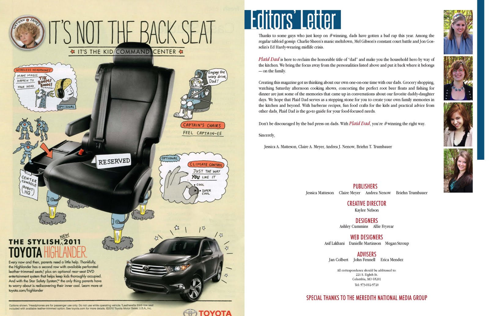
Response: The END of Plaid Dad (print edition)
I cannot express in words the weight that has been lifted off of my shoulders now that the print version of Plaid Dad is at least done. The hardest part is behind us. We are still working on our website and our iPad app, but since we have all of our design structure down and finalized from print, it hasn't been too difficult to transfer our tone, color palette, templates, etc. into technological prototypes. We are off to Iowa to present to Meredith next Friday. Although I am nervous, I couldn't be more proud of all the hard work each member of the team put into it. I know our countless hours spent on tweaking everything about the design will show through, and even if not everything about Plaid Dad is loved by everyone we present it to, I know we will have so much invested in it that we will be able to strongly defend ourselves, and I'm sure they will see how much passion we have for how it turned out. Here are some samples of some of the final pages (note: keep in mind that some of them are much lighter in the jpeg format)


I'll keep ya updated on our website and iPad progress!
You Can't Miss... This!
34 Cleverly Designed Inventions
I mean, they might be created using a different kind of design, but it's still design, right?


That's all for now, brown cow!
- Kaylee
I like the background that you created for your cover. I think it is fun and fits the photo well. I don't know anything about the group, but I would imagine that it fits their personality. The headline, I think, is a little hard to read, but I like the style of it.
ReplyDeleteYour magazine has come a long way from the prototype you first showed in class. I think you did a good job taking the feedback everyone gave you and incorporating your own style in the book. It looks really nice.
ReplyDeleteI like how your cover turned out! The rain illustration you used in the background is neat. It really adds to the design and tone.
ReplyDeleteThe Plaid Dad prototype looks great. I really like the color palette and the way the content is organized. I'm excited to see it in print.