3.23.2011

The Week Before the Much-Needed Spring Break

T-minus 36 hours until I am on my way back to the lone star state to spend some time with the family, catch up on schoolwork and spend as many seconds as possible in the sun and amazing weather outside. It really couldn't be coming at a better time. It's always at this point in the semester where everyone is itching for a break from the monotony that is life. The anticipation has definitely risen the difficulty level of this week. Consistently warm weather and sunshine, here I come! But until then...


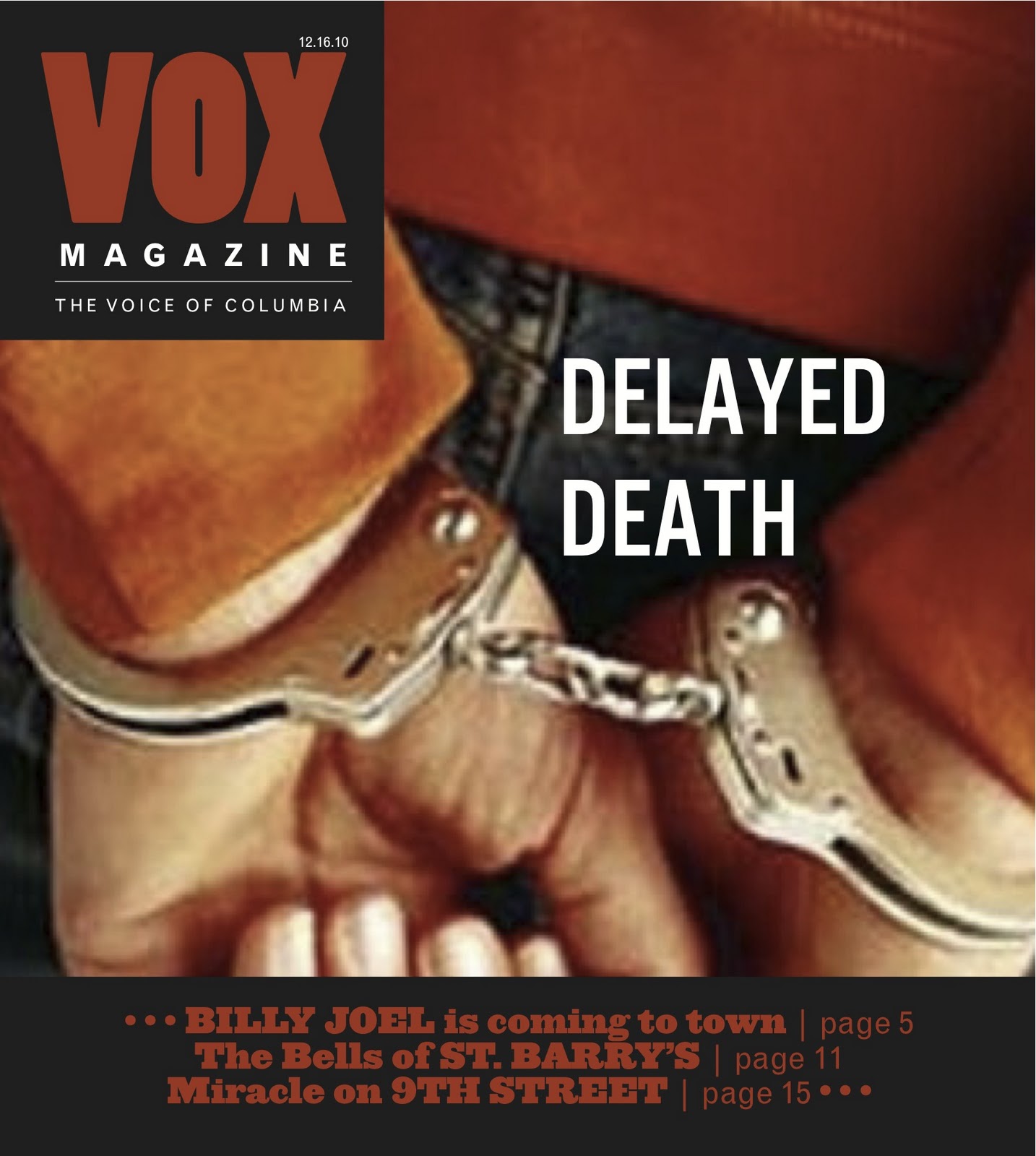
Critique: Vox Magazine's Travel Issue

My main contribution, the Branson feature.


So I began talking about the travel issue last week and the chaos of figuring out everything we were responsible for and then getting it all done. But alas, it did get done and is currently on the newsstands. I began this feature much "kitchier" (is the word that kept being used) and this final product looks fairly different. It's interesting because my very first draft of this feature is actually probably closest in tone to how it turned out, but then I was told to make two versions: one more kitchier, and the other scaled-back. I then took elements of both and ended on this.

Something that Jan and Erica spoke to me about today in my portfolio review was my creativity being compromised by my limitations with designing software. As an example, they pointed out how I originally wanted to do a flowing-type of music staff like this, but didn't think I'd be able to create one that looked good enough in Photoshop, Indesign, Illustrator, etc. Thus, I searched around for a non-copyrighted photo and could only find a straight music staff, took that into illustrator and made it look less formal, and used that on my original draft. When Erica was working with me and suggested to do a more playful staff that flowed, I explained to her how I had wanted to but didn't think I could. She then proceeded to create the purple music staff that ended up appearing in these two spreads.

I think that for my first feature design for Vox, with the copy and photos evolving, I am mostly proud of the results. It is hard working with so many different people who are seeing the story from different point of views, so I think a lot of working with an actual magazine staff is being flexible as a designer. Having to change your pieces multiple times as the story and the photos take on a more permanent tone is something you should just expect. Once you take on this attitude, I think designing for the publication becomes more fun and less of a chore.


Response: First Run-Through of Meredith Publications


Getting to see everyone's first design drafts of their magazines was both exciting and intimidating. I don't actually feel as though we're behind in our magazine, but I was surprised how much everyone had gotten done and how hard everyone had been working. The magazines are as follow:

Nosh: Wow. Y'all are organized! There are so many details and elements that are already included in the designs, which look very clean and polished. The color palette is definitely clearly defined. The magazine as a whole is looking very cohesive so far, and in fact I'm thinking that there could even be some more deviation from that cohesive look, in the features especially. The departments are working very well on the defined grid, and I think you are probably the furthest along. As far as working on the next drafts, I would say to make it look less "white" as a whole... put more color in the department pages other than just the small elements. It's coming along great!

Plaid Dad: I think we are truckin' along... pulling together a more cohesive look that combines all three of our visions. I'm not sure what everyone else thought about what we have thus far, but I do think we've come a long way in the last couple of weeks and have been working very closely with our publishers.

Cupboard: I think this publication has taken on a very interesting tone. I think that you have done a great job, considering some of the issues you have had, and I am really partial to the logo you ended up with at this point. I think you have some really beautiful feature spreads, but perhaps would maybe work on making your look more cohesive to really nail down the specific tone you are going for.

Modern Midwest: I'm a little sad that your logo was changed... I thought the double "M" was a very branding element. However, I do think the logo you think you're going to go with now fits the tone well. I think that you're working with a nice variety of templated grids and variety within your features. I would just be careful that this variety doesn't confuse the tone you are choosing.

Shindig: I am really "shindigging" all of  your design elements and colors. I think that they are very bold and yet not overpowering. Since you also have only three designers in your group, I'm sure you have also realized that each designer has more to do individually than if we had four designers. How are you liking this? Do you feel like it's easier to communicate with less people, or harder because there are less ways to split it up?


You Can't Miss... This!


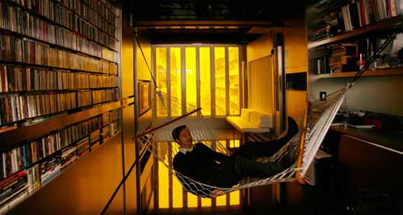
I know I have said before how I wish I was more well-versed in architecture design. Well I especially wish this when it comes to making 24 rooms out of only 344 sq. feet. This would really come in handy. Architect Gary Chang in Hong Kong has figured out this amazing design where he has a guest room, a bathroom, a kitchen, library, master bedroom, etc. etc.


ALSO - Just for funsies...

The perfect chair for clingy-lovers. I just find it funny after watching so many people sitting on each others' laps.

What a simple design, and yet so useful.


Well, until next week...

Later alligator,
        - Kaylee

3.16.2011

The week of Randomness

The last week has been a break in the mold of my life's normality. That's not to say it wasn't a good thing... it was actually fairly refreshing. I had to go back home to Grapevine (Texas) this weekend for essentially about 48 hours for my cousin's wedding... random. It started snowing Sunday night and continued all day Monday, and today I sat and ate outside at the tables downtown in the sunshine and nice weather... random. I saw a poster in my apartment complex notifying everyone of a lost kitten, the same lost kitten (coincidentally) that I found meowing at my doorstep last week. Random.

I could go on, but I'll stop there. And go on to...


Critique: 5 Final SJI Logos


Last week, we submitted all 20 of our logos and spread them out for the class to vote on. After everyone voted on their top 3 choices for each person's collection, Erica, Jan and Greg went through and chose the 5 we should work on and gave us advice on what we should change for our finalized works. Greg's biggest concern was that the logos didn't represent the idea of diversity well enough ( as the Sports Journalism Institute strives to bring both women and minorities in to the newsroom). It was really tough to try and portray the idea of diversity in such a small space and with so little elements. These were my revised 5 products -
I wasn't sure how to really tweak my logos, other than adding a little bit of color and trying to make the baseball stitches on the bottom left logo less literal. This Tuesday, however, Jan, Erica and Greg went around yet again and chose their two favorite (or in my case, three) out of our five.
      These are the three final logos I submitted. I added even more color after their comments yesterday, and tweaked the fonts and tracking a bit. I think this assignment was a really good exercise for me in order to get me thinking about design in a different way, the way of logos that is. I really liked getting to see what everyone else came up with while working with such limited material.


Response: Vox Magazine's Travel Issue

The. travel. issue. Well now, what can I say. At the beginning of the semester, when I saw four of our names under the travel feature, I just figured the feature would be long and we would all split it up. However, three other designers and myself quickly learned that this was not just a feature in an issue, but rather a whole special issue. 

So the last couple of weeks have been full of redesigning many of Vox's small design elements to match our theme of travel. We redesigned the byline style, the calendar, film fare, Ask Columbians (Bransonians), the sidebars, the heading at the top of each page, info boxes, chose new font families and color palettes, had two features to design, etc. 

My main focus was the Branson feature. Two of the writers and one of the photographers on Vox's staff traveled to Branson for a weekend and basically journaled their trip in both words and photos. Originally it was only slated to run in one spread, but the editors canceled one feature for print and moved it entirely online, so the Branson feature was allotted another spread. 

I think it was a really useful opportunity to see what goes into designing a whole magazine and recognizing all of the tiny elements you don't think about needing to be designed, especially with our Meredith prototypes in the works. It is a lot of dang work. I really cannot wait for the issue to come out tomorrow so I can see all of our work actually come to life in print! 

I will post photos of the issue, and the Branson feature, next week and critique it. :)

You Can't Miss... This!

The 500 Colored Pencils of Felissimo
      - So there are all types of "insert any word here" of the Month Club, where the club sends out samples of that product to the club members. Here, you can sign up to get sent 25 colored pencils each month for 20 months. They also send you a special case to hold all of the pencils, and each case they send you can link together, so at the end of the 20 months you can have a big display of all your colored pencils together. If you're impatient though, (like I would be) you can order all at once. Check out the different displays that've been made.


Also, check out this video. I thought this was pretty timely because of the iPad conference so recently. There is now a program for the iPad called LetterMPress that acts as an old letterpress, but electronically, so you can make letterpress art from the program. 

Here's the link to the video!


After while Crocodile,
        - Kaylee

3.09.2011

The Week of A LOT of Driving

Just like last week, this week has been crazy busy. I know this is pretty much every week, but the last two weeks have been exceptionally crazy. However, I really only made it crazier after driving 30 combined hours in the car between Thursday and Monday during a last-minute trip back to Texas. Safely back in Columbia with no rising insurance or broken truck pieces (only bags under my eyes), I have worked on a lot in a short amount of time... such aaassss...


Critique: SJI Logos


When Greg Bowers came to talk to us designers as a class a couple of weeks ago (was that all it was?! Time blurs together...) about the Sports of Journalism Institute, I was a bit anxious about having to design 20 logos for a society revolving around something in which I knew nothing about. However, when I got started, I was actually very surprised at how quickly the ideas started flowing. Not to say that cranking out a total of 20 was easy and that my creativity started running low around #15, but I found that after I would construct one, I would find think, hey I really like that typeface, but I want to use it with a different art element. So basically the trying to think of 20 completely different ideas was pretty tough, but knowing I had to get 20 done helped me to look at my previous ideas and how to tweak them and improve them.
  

It was surprising to see which ones my classmates voted for as the top five, as two of my favorites also seemed to be others' favorites, but the others that were voted on were not ones I particularly cared for. However, after hearing everyone else, that seemed to be the case with a lot of people. It's interesting how different people's points of view are, and how we think something we come up with is terrible when really it's the class favorite.

For next week, we are choosing only five to work on and recreate. I'm wondering if after that Greg, Jan, Erica and eventually SJI are just going to choose out of (18x5= 90 logos)?? That's a pretty large pool to just choose one. Perhaps we will eventually have to narrow it down to one. Either way, I think this assignment was refreshing because it's something very different than the Vox and Meredith prototype designing that we've been doing. I think that there are certain people who are better at designing logos than features, for example, because they are short and punchier, whereas others have more trouble because they have less space to get their idea across.


Response: iPad Conference


ipad event


Oh... the iPad. Why do I feel like the gadget has worn out its newness, and yet I feel like I never really heard many things (good or bad) about it until its been blowing up lately in the magazine world! I was talking to some younger Mizzou journalism students today who said that the requirements for the school of journalism here are changing so that now you will have to have a certain kind of MacBook, not just an Apple computer, and also some sort of touch gadget, whether it be an iPhone, iPad... etc. This is just so interesting to me, since I've only ever touched an iPad while playing in the Apple store. I just never thought there was anything so revolutionary about it... the fact that you touched the screen in order to use it instead of a mousepad didn't seem all that different.

But, I do agree that this tool makes complete sense for journalism. With print journalism, readers actually get print magazines that they can touch, carry around with them, flip from page to page, even make notes in the back or fill in quizzes with pens. When magazines started going online, there was none of this same feel anymore. Having the iPad almost seems like the middle ground, like the step between print and online, because you can touch it, carry it around, essentially "flip" from page to page.

At the iPad conference, Mike Haney was talking about how really it doesn't do a whole lot to ask readers what they want, because they don't know what they want. And they don't know what they want because they don't know what they can get. It is similar to when the first inventors of automobiles asked people what they wanted out of their transportation, and they said a faster horse. Well, yeah, because they didn't know that an automobile was an option or even what it was!

So, no I'm not sure whether all magazines are eventually going to be read on a device like the iPad instead of on paper, or if elementary school kids will stop learning how to physically handwrite anymore because they will all learn how to type instead, but either way the speakers at the conference made it clear that no one really knows. It is a general consensus of not knowing. Thus, everyone is just experimenting.

Mike Haney also said that if we were to take anything from his lecture, remember to always "try new things!"


You Can't Miss... This!


The Stockholm Public Library in Sweden. Now, architectural and interior design is a whole sect of design that I really admire and by which I am fascinated, but really don't know much about. Olivier Charles creates a virtual world for the interior design to this library. Look at the progression...
The last one is the finished product, actually located in the library in Sweden. I want to go here so badly. I'm pretty sure this would just kill Belle from Beauty and the Beast.

Also, something just fun, is some patchwork on the exterior of buildings with legos instead of concrete or brick. This is by Dornob Design Ideas. Really... what CAN'T you do with Legos??

Alright, well don't get too distracted rummaging through your old boxes trying to find your Legos... or googling "whole Lego houses" like I might have after seeing these...

Until next week - 

Ciao Brown Cow,
       - Kaylee


3.02.2011

The Week of Barely Managed Chaos

Wow. What a crazy and hectic last seven days. Involving things like housing lost kitties, internship interviews, last minute plans to drive back to Texas and of course, a lot of designing.

Critique: Lethal Injection Covers


So this week was actually the first week I designed covers for Vox to compete within my cover group. We designed two different covers as a whole class the first two weeks of the semester, but since I am in the 5th and last cover group, it was a while before I did any more. The Vox feature in which we designed the covers around was lethal injection, but that was really about as much as we knew. When brainstorming ideas for my designs, my mind kept automatically picturing a giant needle. I mean it's pretty standard... someone says lethal injection, you think needle, right? However, I had qualms about that possibility... I felt like a giant needle could mean so many different things if a passerby glanced at it on the cover of a huge stack of Vox magazines in the magazine rack, and while that's part of the glory of a headline (to help explain), I felt that more context was needed. So, I decided to only actually feature a needle in a small detail, as replacing it as the "I" in the first cover design. I realize that this is simply an opinion of taste and context, and would totally understand Vox's decision in deciding to go with a needle photo.


So my thought process here was to quickly evoke the feeling of prison with the close-up of the bars, and feeling trapped. I wanted to keep it colorless and stick with the black and white to enhance this feeling. The feedback I received was to maybe have a shot of looking inside an empty-looking cell with the prisoner sitting in the middle, probably to add more of a personality and face to the issue. It would essentially be a placeholder photo, hoping that the photographer would take a photo similar when they shoot inside the prison tomorrow. 


This one was pretty much shot down. Though, I don't disagree whatsoever. My thought was that since the aesthetic drug is running out, and that's essentially the issue that Vox is angling the story toward, the pills spilling out of the bottle would be a good representation. However, the aesthetic isn't a pill. It's a liquid injected into you via IV. So, basically it didn't make any sense. Ex'ed out.


I think this was pretty much the most popular option. The idea of the hands behind the back handcuffed seemed to be overall liked, however I agreed with the notion that my font on this headline didn't really fit, and so for my final draft I took the typeface from the first jail bars cover and used it for this one as well. I also ended up changing the red color of Vox and the sell lines to a more orange color so it wouldn't look so "Hellfire redish."

Overall I think this cover was fairly difficult to design. The issue of lethal injection is a serious one, and thus it made it hard to balance serious enough, but not too gruesome or graphic. Either way, it wasn't a cheerful design.


Response: Historical Perspectives 


I presented a historical perspective on National Geographic, which back when I was set on photo and being a photojournalist, was one the magazines I admired the most. I am absolutely amazed with their photography all the time, which obviously a lot of others are too since it's one of the highest-regarded magazines for its photos. To be able to look at issues from over 50 years ago and still see great photos is pretty amazing. Design-wise, there are some noticeable differences that I talked about in my presentation, such as the lack of whitespace, straightforward use of text, photos rarely bleeding across the spread, and the more book/journal feel the design evokes.

After being presented with other publications from others though, I realize why Jan said National Geographic would be more difficult. Other publications, like Harper's Bazaar, Vogue, Esquire, etc. were really trying to break the mold of design and do things that were very different, and essentially "breaking the rules." This doesn't seem to really be National Geographic's style. As Jan said, they do spend a lot of time and energy on their designs, so it's not like design is something they're unconcerned with. They just work in it a way to showcase their amazing stories and photography.

I haven't ever spent a good chunk of time looking through old issues of magazines, so these presentations are generally showing me spreads and designs I've never seen before. And in fact, many of them are so different than what designs are currently, so it's very interesting. I'm actually really looking forward to see the rest of the presentations since about only half of the class presented.


You Can't Miss... This!


So #1) Bompas and Parr "Architectural Foodsmiths"
            So if you've ever wanted to design food installations, specializing in jello, these are the guys you should talk to. They work with architects to design these amazing jello molds that they then sell to companies like Disney, Kraft, and even museums.


#2) Atipo - A swiss graphic design legacy works with first of all putting different fonts into paint, and not only that, but then actually painting it onto faces. Check it out.


This is probably one of the coolest things I've ever seen. I want Helvetica Bold painted on my face.


Alright, that's it 'til next week.


Best wishes little fishes,
          - Kaylee