Critique: Lethal Injection Covers
So this week was actually the first week I designed covers for Vox to compete within my cover group. We designed two different covers as a whole class the first two weeks of the semester, but since I am in the 5th and last cover group, it was a while before I did any more. The Vox feature in which we designed the covers around was lethal injection, but that was really about as much as we knew. When brainstorming ideas for my designs, my mind kept automatically picturing a giant needle. I mean it's pretty standard... someone says lethal injection, you think needle, right? However, I had qualms about that possibility... I felt like a giant needle could mean so many different things if a passerby glanced at it on the cover of a huge stack of Vox magazines in the magazine rack, and while that's part of the glory of a headline (to help explain), I felt that more context was needed. So, I decided to only actually feature a needle in a small detail, as replacing it as the "I" in the first cover design. I realize that this is simply an opinion of taste and context, and would totally understand Vox's decision in deciding to go with a needle photo.

So my thought process here was to quickly evoke the feeling of prison with the close-up of the bars, and feeling trapped. I wanted to keep it colorless and stick with the black and white to enhance this feeling. The feedback I received was to maybe have a shot of looking inside an empty-looking cell with the prisoner sitting in the middle, probably to add more of a personality and face to the issue. It would essentially be a placeholder photo, hoping that the photographer would take a photo similar when they shoot inside the prison tomorrow.

This one was pretty much shot down. Though, I don't disagree whatsoever. My thought was that since the aesthetic drug is running out, and that's essentially the issue that Vox is angling the story toward, the pills spilling out of the bottle would be a good representation. However, the aesthetic isn't a pill. It's a liquid injected into you via IV. So, basically it didn't make any sense. Ex'ed out.
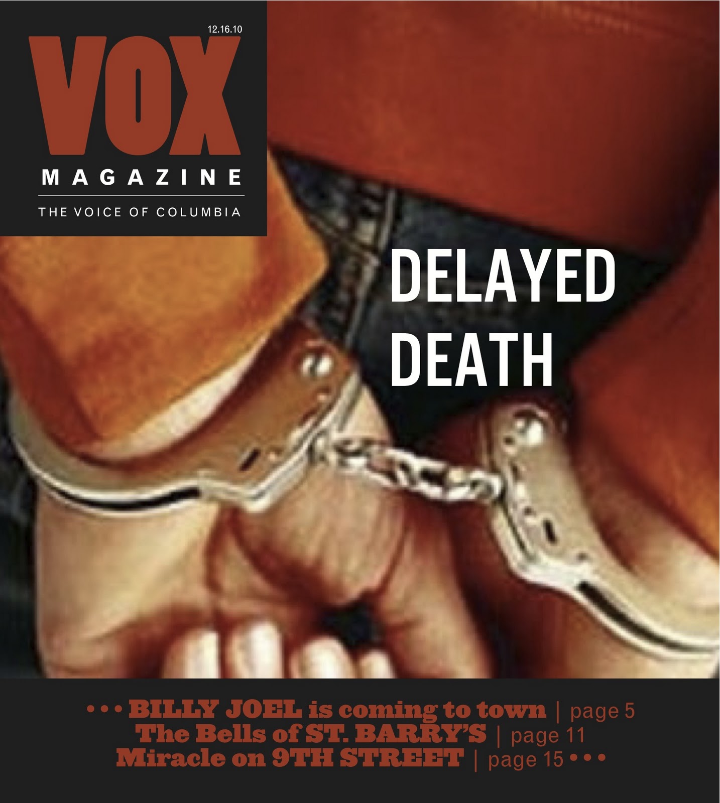
I think this was pretty much the most popular option. The idea of the hands behind the back handcuffed seemed to be overall liked, however I agreed with the notion that my font on this headline didn't really fit, and so for my final draft I took the typeface from the first jail bars cover and used it for this one as well. I also ended up changing the red color of Vox and the sell lines to a more orange color so it wouldn't look so "Hellfire redish."
Overall I think this cover was fairly difficult to design. The issue of lethal injection is a serious one, and thus it made it hard to balance serious enough, but not too gruesome or graphic. Either way, it wasn't a cheerful design.
Response: Historical Perspectives


I presented a historical perspective on National Geographic, which back when I was set on photo and being a photojournalist, was one the magazines I admired the most. I am absolutely amazed with their photography all the time, which obviously a lot of others are too since it's one of the highest-regarded magazines for its photos. To be able to look at issues from over 50 years ago and still see great photos is pretty amazing. Design-wise, there are some noticeable differences that I talked about in my presentation, such as the lack of whitespace, straightforward use of text, photos rarely bleeding across the spread, and the more book/journal feel the design evokes.
After being presented with other publications from others though, I realize why Jan said National Geographic would be more difficult. Other publications, like Harper's Bazaar, Vogue, Esquire, etc. were really trying to break the mold of design and do things that were very different, and essentially "breaking the rules." This doesn't seem to really be National Geographic's style. As Jan said, they do spend a lot of time and energy on their designs, so it's not like design is something they're unconcerned with. They just work in it a way to showcase their amazing stories and photography.
I haven't ever spent a good chunk of time looking through old issues of magazines, so these presentations are generally showing me spreads and designs I've never seen before. And in fact, many of them are so different than what designs are currently, so it's very interesting. I'm actually really looking forward to see the rest of the presentations since about only half of the class presented.
You Can't Miss... This!
So #1) Bompas and Parr "Architectural Foodsmiths"
So if you've ever wanted to design food installations, specializing in jello, these are the guys you should talk to. They work with architects to design these amazing jello molds that they then sell to companies like Disney, Kraft, and even museums.


#2) Atipo - A swiss graphic design legacy works with first of all putting different fonts into paint, and not only that, but then actually painting it onto faces. Check it out.


This is probably one of the coolest things I've ever seen. I want Helvetica Bold painted on my face.
Alright, that's it 'til next week.
Best wishes little fishes,
- Kaylee
The jello looks awesome. I think some of my favorite grammar-type products are the question mark, ampersand and exclamation point coat racks that my roommate bought to hang in our hallway. It's funny when people notice them for the first time.
ReplyDeleteThose jello molds look delicious. Now I'm hungry... I'm glad you decided to go with the delayed death cover. I think it was a very intriguing photo and worked well with the headline. I remember that for your final draft you played with the typography by making the letters fade, which I thought was great.
ReplyDelete